Appearance
User Interface
Overview
Here is an overview of the main components of the ImageFlow app user interface:
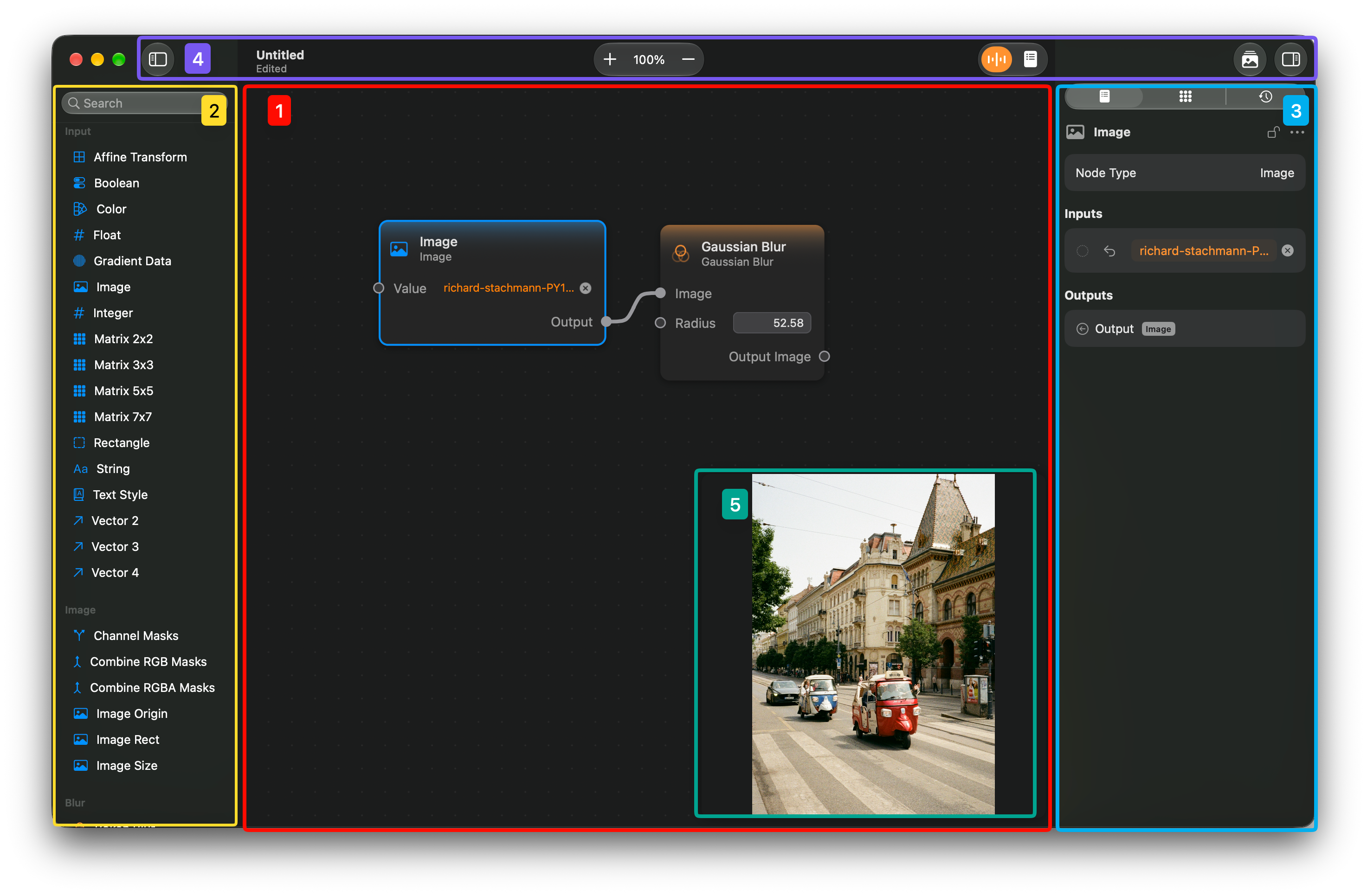
- This area is called the Canvas. This is the area where nodes are placed, moved around, and connected via edges. This is the core of the ImageFlow document, determining the ImageFlow graph, where all the operations on images and other values happen.
- The left sidebar is where the Node Palette is placed. Here all the available nodes are listed, grouped by categories. There is also a search bar available which will filter the nodes, showing only the ones with names which contain the searched text. To create a node of a given type, you can drag it from the palette into the canvas, or double-click on it and it will be created in the center of the canvas.
- The right sidebar contains the inspector panel. This panel contains three different tabs. The first one is the Node Tab. Here you can inspect the currently selected node, editing, and viewing its values. Next there is the Canvas Tab where you can control the canvas viewport and save locations of the canvas as bookmarks. Finally there is the Undo History tab, where you can navigate the undo history of your document.
- This is the toolbar of the app, which provides several controls such as the canvas's zoom levels, canvas snapping, a list of nodes, access to the asset browser, among others.
- Is the Floating Preview panel. It shows a preview of the output images of the node that is currently selected. The floating preview can be docked in any corner of the canvas. It can also be docked bellow or above, or opened in a separate window.